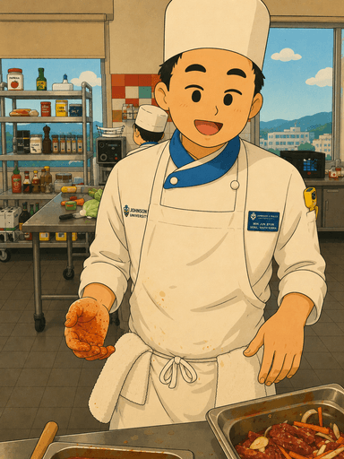
iOS product design · Summer 2026
Luma
StatusFigma concept prototype · not yet tested with users
Designing beyond the RSVP.


- Problem
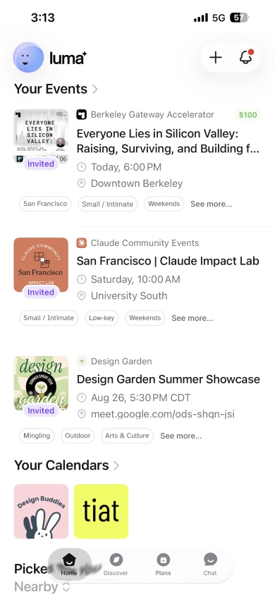
- Luma gets people to RSVP, but attendees can’t tell if an event fits, often arrive alone, and lose touch with the people they meet.
- What I did
- On a team of three, we ran 6 interviews and an 8-person survey together. I designed onboarding, the visual system, and the final hi-fi screens for every flow.
- Result
- A Figma concept prototype of three flows. My onboarding turns 12 answers into a portrait people can review. Not yet tested with users.
- 6
- interviews
- 8
- survey responses
- 12
- onboarding questions
- 39
- screens across 3 flows
My part
- Research
- Ran 6 interviews and an 8-person survey with the team
- Onboarding
- The 12-question preference survey and the portrait at the end
- Visual system + hi-fi
- One visual language, and the final hi-fi screens for all three flows
We designed as one team. Christina led Event Buddy and secondary research; Navneet led Plans, post-event messaging, and competitive analysis.
Problem
An RSVP is not a connection.
Luma handles discovery and sign-up. It stops before the parts attendees worry about: whether an event fits, who to arrive with, and how to see people again.


- 51%
- of Americans find it difficult to make new friends
- 62%
- say making friends was easier at another time in their life
Pennington, Hall & Holmstrom, PLOS ONE, 2024: national surveys of U.S. adults, 2022–2023.
Choose
Deciding is hard.
A Luma reviewer asked to save events while still undecided. App Store, Aug 2025
Arrive
Arriving alone is a worry.
One Luma host already offers to pair people who don’t want to come alone. Host’s event page
Reconnect
Following up feels awkward.
An attendee wasn’t sure how to follow up with people they met. Reddit, Jul 2025
Public examples, not study participants. The Reddit post is about Meetup, a similar event app. Luma already has chat; this concept adds guidance around it.
Research
6 interviews, 8 survey responses.
We ran 6 interviews and collected 8 survey responses. The counts below come from the survey; they describe this small sample, not event attendees generally.
Company
4 of 8 wanted a buddy.
Make pairing optional.
The other four were fine either way.
Led toAn opt-in Event BuddySee the decision ↓Atmosphere
6 of 8 chose structured activities.
Show what an event feels like.
Six respondents selected structured activities, informing the decision to ask about event format during onboarding.
Led toPreference onboardingSee the decision ↓Comfort + access
7 of 8 picked an identity or access option.
Ask about comfort directly.
This count combines identity and access options. It does not identify which specific accommodation each person needed.
Not yetNothing yet
Design decisions
Three decisions, each from a finding.
Onboarding · designed by me
Ask what the room should feel like.
- Evidence
- 6 of 8 survey respondents chose structured activities. Event format became an onboarding input.
- Considered instead
- Progressive onboarding, asking a few questions at a time.
- Decision
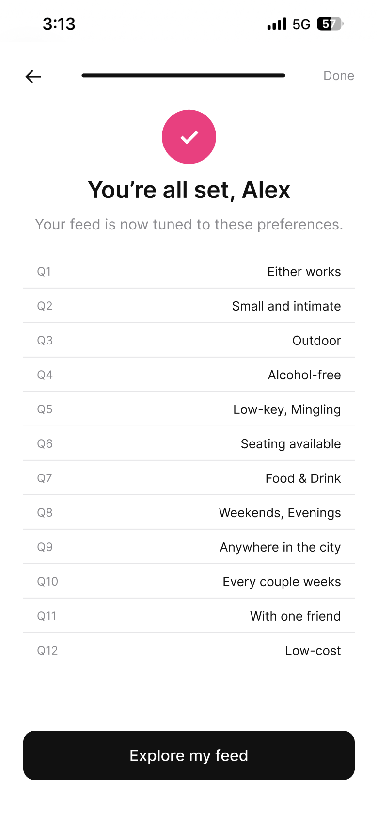
- Ask about vibe, size, and setting, then show a preference portrait. The sketch, wireframe, and built screen below show how that decision took shape.
How it got here
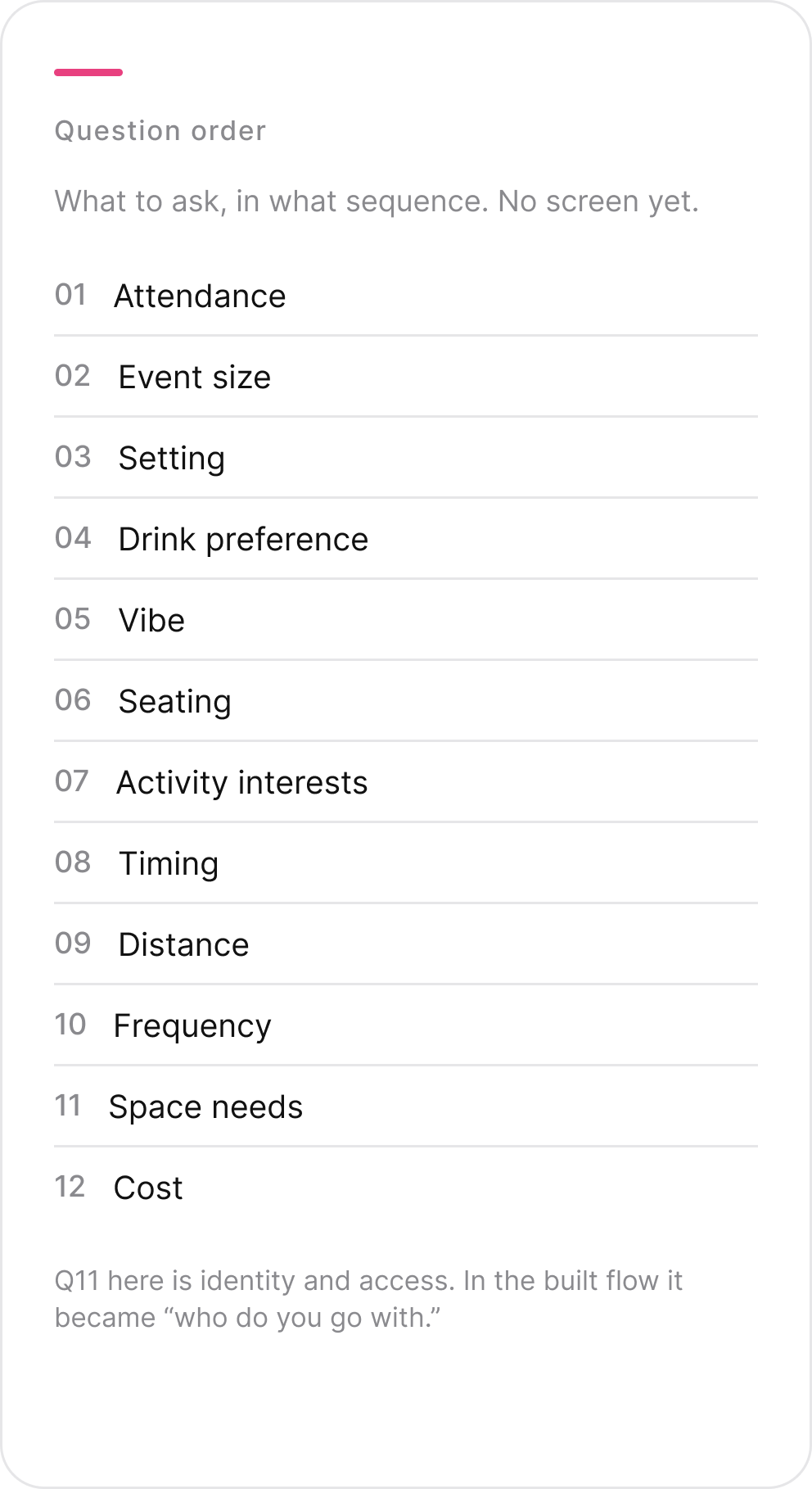
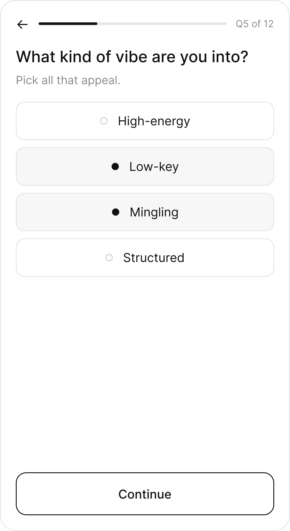
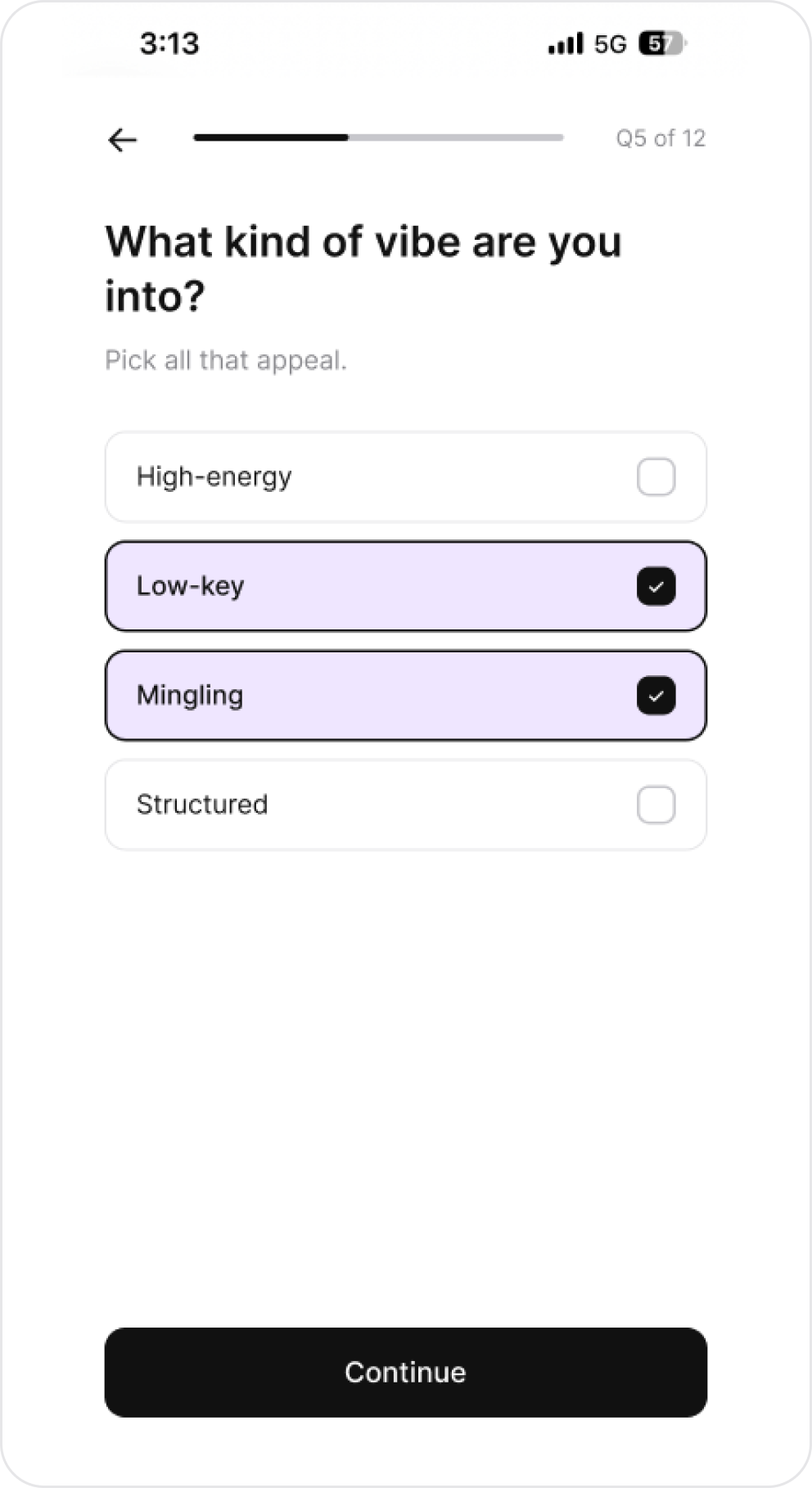
Still to testThe survey supports asking about format; it does not establish that twelve questions are the right length. Test completion and whether the portrait feels worth the effort.
What each answer changes
- Q1Buddy, solo, or eitherWhether Luma offers you an Event Buddy before the event
- Q2Event sizeSmall / Intimate or Large / Lively tags; reconnection suggests small events you’d both enjoy
- Q3Indoor or outdoorIndoor / Outdoor tags; shown as a shared trait when choosing a buddy
- Q4Drink preferenceAlcohol-free tag on events; kept private, never shown to a match
- Q5VibeHigh-energy, Low-key, Mingling, Structured tags
- Q6SeatingSeating tag
- Q7ActivitiesTopic tags: Tech, Food & Drink, AI, Arts & Culture, and more; a buddy match reason: “You both like food events”
- Q8TimingWeekday / Weekend and Daytime / Evenings tags
- Q9DistancePartly: city and district tags, but no distance filter
- Q10How oftenNothing yet
- Q11Who you go withNothing yet
- Q12CostNothing yet
Event Buddy
Offer company. Keep the choice.
Because the survey split 4 to 4, the invitation gives two equal answers: find me a buddy, or go on my own. A notification starts it, and the reply happens over SMS.

What I learnedWhen research splits evenly, design the choice instead of picking a side.
V1 · Word replies
Reply “Yes” or “No”
- What I built
- The first text asked people to answer in words.
- Why it failed
- The team’s note on the flow: “assume that people will misspell.” A typo leaves the reply unreadable.
V2 · Final
Reply 1 or 2
- What I built
- 1 for “Yes, find me a buddy,” 2 for “No, I’ll go on my own.”
- Why it works
- One digit is hard to mistype, and the two options stay equal.
Reconnection
Put the people you met next to your plans.
From Plans, find someone you met and choose a shared event or a message.
Considered insteadA separate Connections tab, as in the planned five-tab bar.
TradeoffConnections moved into Chat and Plans. One fewer tab, but a less direct route to a person.
- Planned tabs
- HomeDiscoverPlansConnectionsProfile
- Built tabs
- HomeDiscoverPlansChat
What I learnedFewer tabs looked cleaner, and made the key task harder: finding someone you met.
Visual system
One visual language across three flows.

What I learned
The payoff came too late.
No launch metrics here; it’s a concept. What I’d carry into the next project:
Next user test · proposed
- OnboardingSet preferences and choose an eventObserve hesitation or abandonment; ask what answering helped them do
- ChoiceAttend without a buddyCheck whether the solo path is discoverable without assistance
- ReconnectFind someone you met and arrange a next stepObserve the first tab chosen and where the person gets stuck
I cut the question my research said mattered most.
7 of 8 people picked an identity or access option, and I replaced that question with “who do you go with.” Next time, every cut gets checked against the findings, with the reason written down before a question leaves the flow.
I built the input before the payoff.
I prototyped twelve questions and a portrait, but not the “why this event fits you” screen that makes answering worthwhile. Now I design the payoff screen first and work back to the fewest questions it needs.
What’s next
Not built yet
- “Why it fits” explanations
- The identity question
- An editable Profile
- A Connections view
Test next
- Onboarding length
- Whether people can find someone they met