
Product + interaction design · Spring 2026
Pax
StatusCoded prototype · tested in 6 moderated sessions
An airport journey you can make on your own.
- Problem
- Older travelers can handle any single airport obstacle, but missed announcements, small signs, and long walks add up until flying alone feels out of reach.
- What I did
- With two teammates, I interviewed experts, designed a guide robot and companion app, and rebuilt the app prototype in Cursor for testing.
- Result
- In 6 moderated sessions, 4 of 6 found Pax helpful, but none used “I need to rest,” the one control the concept depends on.
- 3
- expert interviews
- 6
- concept-test participants
- 6
- moderated usability sessions
- 14
- survey responses
My part
- Expert interview
- Interviewed Samuel Ekanem on healthcare access
- Prototype
- Refined the app screens and rebuilt the tested prototype in Cursor
With the team
- Personas, Crazy 8s, storyboards
- Concept test with 6 people
- 6 moderated usability sessions
- Synthesis
- Product-market-fit survey
With Amanda Yu and Hannah Wang. Amanda led research facilitation and recruiting, and interviewed Malavika Oak; Hannah interviewed Alex Hogue.
Problem
The friction is cumulative.
How might we reduce the compounding friction of long-distance travel for seniors with health constraints, so they can experience the world by themselves?
Three demands
Orient. Adapt. Keep going.
Find the route and the right gate. Respond to delays and gate changes. Manage distance, fatigue, and belongings.

Research
What experts told us to design for.
These are design implications synthesized from expert interviews. Early persona assumptions are separated below; observations from prototype sessions appear under Testing.
Samuel Ekanem · Healthcare access
Design for interruptions.
Crowds, urgency, and failures are part of the journey. Stopping and recovery belong in the main flow.
Malavika Oak · Senior UX designer, HealthEquity
Control information, don’t remove it.
Keep the next useful step visible. Reveal supporting information when it matters.
Early personas · brainstorming assumptions
These are not interview participants. Created before the expert interviews, their ages and needs are assumptions used to explore the design.
Micaela · caregiver, 16
A route that stays accessible.
Broken elevators and high curbs.
Led toBarrier mapping; remote monitoring deferred
Arthur · traveler, 74
Information he can process.
Low vision and crowded terminals.
Led toHigh-contrast type, one task at a time, a visible guide
Margaret · traveler, 68
Less physical and mental load.
Delays, medication timing, and heavy devices.
Led toFlight information and a 10–15 lb carrying target


Concept selection
Move the work off the traveler.
Wearables won our early votes, but added another thing to wear, charge, and learn. We chose to explore a companion instead.
Why a physical companion? The concept pairs a visible guide with luggage carrying, while the app handles flight information and requests to stop. The voice-navigation preference informed this direction; it did not establish that a robot would work better than a phone alone.


How the direction changed
- 01Crazy 8s
Where should the assistance live?
- 02Early vote
Wearables won, but meant another thing to wear, charge, and learn
- 03Concept test
Six people compared three companion concepts
- 04Direction
Voice navigation, rated the most practical (3 of 6)
Health tracking + carrying
2 / 6 preferred it.
Important, and safety-minded.
Praised for health monitoring and reassurance: “It feels important and safety-oriented.”
Intuitive guiding
1 / 6 preferred it.
Needed more clarity.
The least clear of the three concepts.
Voice navigation
3 / 6 preferred it.
The most practical and realistic.
Helpful in unfamiliar places, and useful beyond older travelers: “People still struggle with navigation even with apps.”
Led toChosen for prototyping
App journey
One journey. One clear next step.
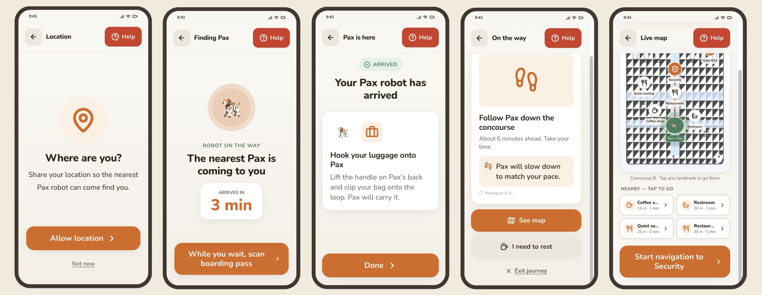
The robot handles the walk and carrying. The app makes the next step clear and lets the traveler pause or ask for help.


The 15 lb carrying target and folding form still need engineering and real-world testing.


Progress
Know what comes next.
Unclear progress became the current step plus the next one, so travelers always know where they are in the journey.
Voice
Speak like a guide.
“Proceed to gate B12” became “I’ll guide you to gate B12.” First-person language makes the guide’s role clear.
Considered insteadSystem phrasing, like “Proceed to gate B12.”
Control
Stop without losing the gate.
- Evidence
- Expert interviews pointed to interruptions and recovery as part of the main journey.
- Decision
- Rest, seat, coffee, or restroom, then return to the same gate. Stopping stays available without losing the destination.
Observed result0 of 6 participants used “I need to rest” in the moderated sessions. Keeping the option available was not enough. See the proposed visibility revision and retest →
Testing
The gaps appeared when the journey paused.
Six moderated, 30-minute Zoom sessions with think-aloud: onboard, find the gate, and find a place to sit and eat. Participants were 21 to 80.
On target · 1
The traveler we designed for.
80, flies about once a year, very little tech use, knows SFO.
Proxy · 2
Close enough to learn from.
A 21-year-old international student, and a 21-year-old with an injured arm who usually travels with someone.
Out of scope · 3
Useful, but not our user.
A former flight attendant (33), a startup CEO (45), and a parent who travels with children (53).
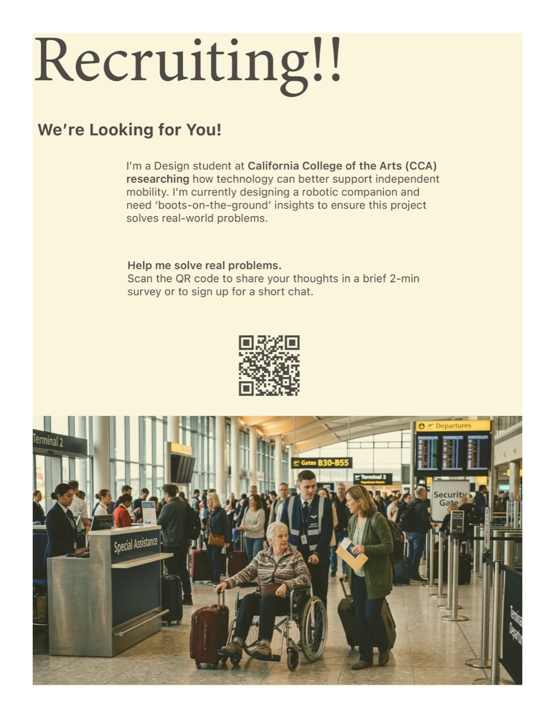
We screened for travelers 65 and older who fly at least twice a year, have mobility or health constraints, and rarely use AI tools, and we excluded tech and UX professionals. Fifteen people answered, mostly younger and tech-fluent, so we widened the criteria midway.
- 4 / 6
- found Pax helpful
- 3 / 6
- hit a call-to-action problem
- 0 / 6
- used “I need to rest”
What people said
“All the call to action buttons were located on the bottom and what I see here is I need to rest, which is, in gray, so it doesn’t look like it’s activated.”
Usability participant, 45 Critical
“If I’m going to an airport now because my hand got a very serious injury, this can really help me.”
Usability participant, 21, recently injured
Orientation
Location and tappable landmarks were unclear.
The map navigation confused participants.
Led toLead with the next turn; keep the map as support
Readability
Small type and dense instructions added effort.
Led to18pt minimum body text, simple steps, one clear action cue per task
Luggage
The luggage hook split the room.
Two found the instructions unclear, two found it helpful, two had no opinion. “I don’t know how that robot can handle or how the robot can have like a hook to, so that it could like put the luggage onto packs.”
Worth keeping. Testers found the restaurant, restroom, and lounge finder, the Help button, the large buttons, and the warm, welcoming UI helpful.

Survey
The survey tested the wrong promise.
Fourteen respondents tried the prototype before answering, but 9 of 14 were students, not older travelers. Only 2 of 14 (14%) would be very disappointed without it, against a 40% product-market-fit benchmark; 8 more would be somewhat disappointed. 12 of 14 rated itineraries and local recommendations important: broad travel-app expectations.
TradeoffInterest in a travel app is not demand for Pax. Responses did ask for adjustable type, contrast, and mobility-aware routes. 7 would pay; 5 of those wanted improvements first.
Proposed revisions
What the next version needs to change.
Three priorities from the sessions. These are proposed revisions, not verified improvements; a follow-up test with older travelers is still needed.
01 · Rest control
From easy to miss to clearly available.
Tested: the gray rest action looked inactive.
Not yetUse a stronger color and verify the proposed 7:1 contrast target. Retest whether travelers notice and use it without prompting.
02 · Permission recovery
From a dead end to an explicit next step.
Tested: declining location sharing left no next step.
Not yetCompare a clear “Decline and exit” path with asking again when location is needed. Check that the choice and consequence are understood.
03 · Task order
From competing tasks to one step at a time.
Tested: meeting Pax and scanning a boarding pass competed for attention.
Not yetComplete the meeting step before introducing scanning. Check whether travelers can continue without moderator help.
What I learned
Test independence at the moment it can break.
Test the one feature the concept can’t work without.
Prioritize stopping and recovery in the next test, before polishing the rest of the journey.
Our personas drifted toward the caregiver.
A caregiver’s need for reassurance can pull the concept toward monitoring. Evaluate decisions from the traveler’s perspective before voting.
The survey answered a question we didn’t ask.
Keep the intended audience in the screener, even when recruiting takes longer. Interest from other travelers cannot establish demand among older travelers.
What’s next
Next study
- Older travelers
- A realistic terminal
- The robot-to-app handoff
- A visible Stop
- Starting before check-in: the ride and the check-in desk